API for OECD data in R
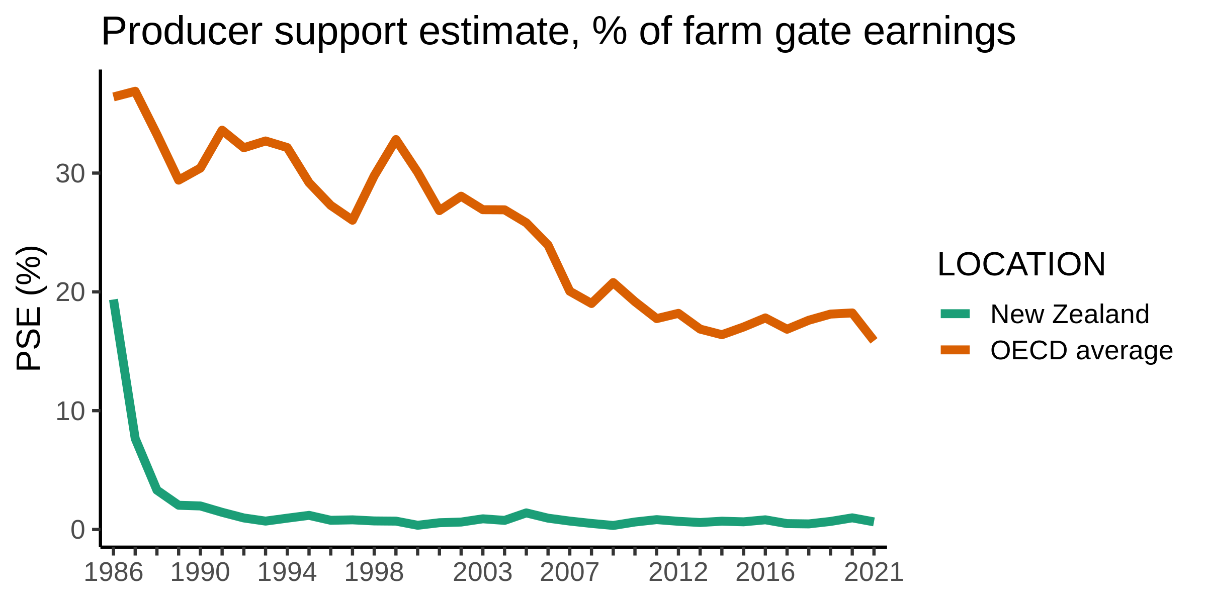
This is a pseudo API, and actually something called RSDMX, but for all intents and purposes it may as well be an API - you can programatically access the data from the OECD. In this example, the R script downloads all the headline percentage agricultural producer support estimates from the OECD database. Then it makes a time series graph of New Zealand’s percentage PSE vs OECD average. Very cool.
Instructions in the script.
#R code for accessing OECD API

#You need a package called rsdmx
install.packages("rsdmx")
library(rsdmx)

#For building a download url, easiest to build your own custom url first. e.g. at https://stats.oecd.org/viewhtml.aspx?datasetcode=MON2021_SINGLE_COMMODITY_INDICATORS&lang=en , you can go to Customise > Selection. WHen you have your desired fields, go to Export > SDMX (XML) and copy the 'SDMX DATA URL'.
data_url <- "https://stats.oecd.org/restsdmx/sdmx.ashx/GetData/MON2022_REFERENCE_TABLE/AUS+CAN+CHL+COL+CRI+ISL+ISR+JPN+KOR+MEX+NZL+NOR+CHE+TUR+GBR+USA+EU+OECD+ARG+BRA+CHN+IND+IDN+KAZ+PHL+RUS+ZAF+UKR+VNM.TO-PSEP.PC/all?startTime=1986&endTime=2021"

#Download the data
sdmx_dataset <- readSDMX(data_url)

#Format the downloaded data into a nice dataframe
dataset <- as.data.frame(sdmx_dataset)


#Now you can make a graph, e.g. of EU v OECD producer support over time.
#Filter out just EU and OECD
graph_data <- dataset[dataset$LOCATION=="NZL" | dataset$LOCATION=="OECD",]

#Change location names to something more user-friendly
graph_data$LOCATION[graph_data$LOCATION=="NZL"] <- "New Zealand"
graph_data$LOCATION[graph_data$LOCATION=="OECD"] <- "OECD average"
#Filter to just the columns we want:
graph_data<- graph_data[, (names(graph_data) %in% c("obsTime","LOCATION","obsValue"))]

#install a graph package:
install.packages("ggplot2")
library(ggplot2)

#Draw a graph
ggplot(data = graph_data, aes(x = obsTime, y = obsValue, group = LOCATION, color = LOCATION)) +
  geom_line(size = 2) +
  scale_x_discrete(guide = guide_axis(check.overlap = TRUE)) +
  labs(title = "Producer support estimate, % of farm gate earnings", x = NULL, y = "PSE (%)") +
  scale_color_brewer(palette = "Dark2") +
  theme_classic(base_size = 16)

#Save the graph
ggsave("graph.png",width = 8,height = 4,bg = NULL)
And the final output… a graph of percentage PSE in New Zealand vs the OECD average.