How to use new Comtrade API using R
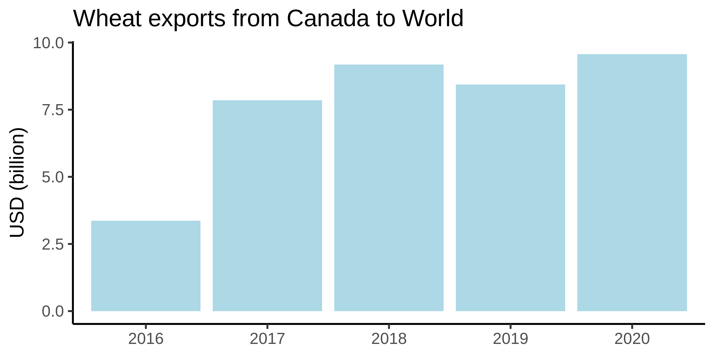
Comtrade recently introduced a new API, which is slightly harder to use than the last one. Here I show how to use it and how to produce a nice graph from it, just like the one below.
At the comtrade website, click the login button, and sign up. You could use a google account if you wish. Once you have logged in, mouse over ‘My Comtrade Free’ at the top and choose ‘My API Portal’. Or just go to https://comtradedeveloper.un.org/apis once you have logged in.
First, you need to get a ‘subscription key’. Click on Products (top right corner).
If you are using a personal account, you can get your personal (and free) subscription key by clicking on ‘Free APIs’ (for a premium account, then you can choose one of the premium options). On the page that appears, enter a name for your subscription key in the box that says ‘Your new product subscription name’. Then click subscribe.
The key should be created instantly and it will say ‘Active’ under the ‘State’ heading. (For premium accounts, it might say something like ‘Pending’ - that means it is awaiting manual verification by Comtrade staff and you simply have to wait and come back another day.
Get your key by clicking on ‘Show’ at primary key. Copy this to a text file somewhere.
The following code demonstrates how to make a simple request using the basic free (new) comtrade API. First you’ll need to download the R function here. It then makes a graph. The demonstration is for wheat exports from Canada to the world.
#This gets wheat exports to the world from Canada in 2016-2020.
#Define and comment/uncomment the location of the comtrade.r file you downloaded
source("/home/USERNAME/comtrade.r") #e.g. on Linux
#source("C:/Downloads/comtrade.r") #e.g. on Windows


#Download from comtrade:
#Note: separate HS_codes with a comma, X for export and M for import, A for annual periodicity and M for monthly periodicity, months can be entered in the period as e.g. 201903 for March 2019.
comtrade_data <- comtrade(API_key="YOUR API KEY GOES HERE",HS_codes="100199",Export_or_Import="X",Partner="0",Reporter="124",Periodicity="A",Period="2016,2017,2018,2019,2020")


#Now make the graph:
graph_data <- aggregate(comtrade_data$"primaryValue",list(Year=comtrade_data$period),sum)
graph_data$x <- graph_data$x/1000000000 #Change the units from USD to billion USD:
install.packages("ggplot2") #install a graph package
library(ggplot2)
#Draw a graph
ggplot(data=graph_data, aes(x=Year, y=x)) + geom_bar(stat="identity",fill="lightblue") + labs(title = "Wheat exports from Canada to World", x = NULL, y = "USD (billion)") + scale_color_brewer(palette = "Dark2") + theme_classic(base_size = 16)
ggsave("graph_Canada_wheat_exports.png",width = 8,height = 4,bg = NULL) #Save the graph```